
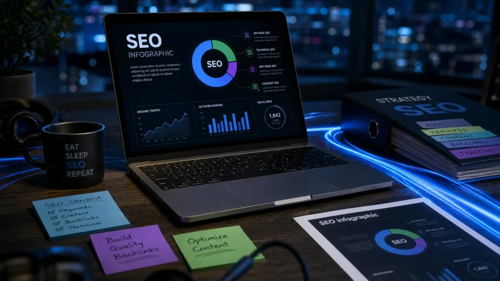
An SEO infographic is not just a pretty visual dropped into a blog post. It is a search-focused content asset: the topic matches user intent, the claims are backed by data, the design makes complex information easier to scan, and the image plus surrounding page are optimized so search engines can discover and interpret it.
Done well, an infographic can support organic traffic, image search visibility, backlinks and social sharing. Done casually, it becomes a heavy image with tiny text, vague file names and no reason for anyone to cite it. The difference comes from planning, not decoration.
What makes an infographic an SEO infographic?
A generic infographic explains something visually. An SEO infographic does that while also answering a search demand. It starts with a question people are already asking, then turns the answer into a visual structure that is easier to scan, remember and reference.
One BrightEdge stat says the human brain processes visuals roughly 60,000 times faster than text. Whether you are summarizing a process, comparing options or explaining a data trend, that speed matters because search visitors decide quickly whether a page is useful. A strong infographic gives them a reason to stay, scroll and share.
Search intent comes before design
The topic should not be chosen because it looks good on a canvas. It should be chosen because there is a real audience need behind it. Keyword research, website traffic data, popular articles on your own site and tools such as BrightEdge Data Cube can help identify subjects with traffic potential.
For example, “technical SEO checklist” suggests a step-by-step visual, while “WebP vs PNG” suggests a comparison table or decision tree. The format should follow the intent. If users want a quick answer, avoid a long narrative poster. If they need to compare options, give them columns, icons and labels they can understand at a glance.
Data and citations make it worth linking to
Infographics attract backlinks when they save other publishers time. A journalist, blogger or B2B writer is more likely to cite a visual that contains strong statistics, expert citations or a clean synthesis of scattered information. Opinion-only visuals rarely earn the same trust.
Before designing, collect the facts you will show. Use recent internal data, industry reports, customer research, product data or expert commentary. Each claim should either be obvious from the data or supported by a credible citation on the page. The infographic itself can stay concise, while the article below it can explain sources and background in more detail.
Choose the right infographic format for the SEO job
Different infographic styles serve different search goals. Choosing the wrong one can make the content harder to rank because the visual does not match what the reader expects to learn.
Google’s Official Guide to Image SEO and Alt Text Optimization · Learn how to optimize your images for search engines with Google’s official best practices for alt text, file naming, and structured data.
| Infographic type | Best use case | SEO value |
|---|---|---|
| Process infographic | Explaining steps, workflows or checklists | Good for practical searches and featured snippets support |
| Comparison infographic | Contrasting tools, formats, methods or products | Useful for commercial investigation and decision-making queries |
| Statistical infographic | Presenting research, trends or survey findings | Strong backlink potential when the data is credible |
| Timeline infographic | Showing evolution, milestones or historical changes | Helpful for educational and reference searches |
| Checklist infographic | Summarizing actions users can apply immediately | Highly shareable and easy to repurpose across channels |
Build a visual hierarchy people can follow
Readers should understand the main point before they notice the details. Start with a clear headline inside the image, then use sections, icons, arrows, diagrams and spacing to guide the eye. Keep the copy concise and easy to understand. Long paragraphs inside an image are hard to read and almost impossible to enjoy on mobile.
Think of the infographic as a stack of meaning. The first layer is the promise, which question does the visual answer? The second is navigation, where numbers, sections, arrows or contrast show where to look next. The third is proof, with statistics, labels, citations and annotations. The final layer is memory, the one shape, metaphor or comparison the reader keeps after closing the tab. When those layers are planned separately, the design becomes clearer because every element has a job.
Readability is an SEO issue, not only a design issue
Color scheme, contrast and legible fonts directly influence engagement. If users pinch, zoom or abandon the page because the text is too small, the asset has failed. Use consistent colors, avoid low-contrast text, and make sure key labels remain readable on a phone.
Accessibility matters too. Do not rely on color alone to communicate meaning. Pair colors with labels, patterns or icons. The surrounding article should also summarize the main information in HTML text so people using assistive technologies, and search engines, are not forced to interpret everything from the image alone.
Optimize the image file before publishing
Image SEO begins before the upload. A search-friendly infographic needs the right file name, format, dimensions and text alternative. These details help search engines understand the asset and help users load it without friction.
Use descriptive file names and alt text
A file called final-version-3.png tells search engines nothing. A file called seo-infographic-image-optimization-checklist.webp is clearer. Keep file names lowercase, descriptive and separated with hyphens.
Alt text should describe the image naturally, not stuff keywords. For an infographic, it can summarize the subject and key value: SEO infographic showing steps for keyword research, visual hierarchy, alt text, file formats and embed code distribution. If the visual contains essential information, the page should repeat that information in text nearby.
Pick the format that fits the visual
There is no single best image format for every infographic. The right choice depends on detail, file weight, transparency and scalability.
| Format | When to use it | SEO consideration |
|---|---|---|
| WebP | Most web infographics where quality and compression matter | Often a strong choice for faster loading |
| JPEG | Photo-heavy visuals or complex gradients | Good compression, but text can lose sharpness |
| PNG | Sharp graphics, transparency or screenshots | Clear detail, but file sizes can become large |
| SVG | Icons, charts and scalable vector graphics | Excellent sharpness when suitable for the design |
Whatever format you choose, test the page on mobile. An infographic that looks impressive on a desktop preview can become unreadable in a narrow content column. Consider adding a smaller preview image that links to a full-size version if the design is long or detailed.
Optimize the page around the infographic
Search engines do not rank the image in isolation. They also interpret the page title, URL, headings, copy, internal links and surrounding context. A strong infographic on a thin page is a missed opportunity.
Give the visual a crawlable editorial frame
Use structured header tags to explain the topic step by step. Add an introduction that answers the query directly, then support the visual with short sections that clarify the data, definitions and takeaways. A concise meta description can improve how the page appears in search results, while a clean URL helps users and search engines understand the subject.
The article should not simply say, “see the infographic below.” It should add value: define terms, explain why the data matters, offer examples and link to related resources. This makes the page useful even when the image is not displayed, and it gives search engines more text to evaluate.
Add sharing and embedding options
Infographics are built for distribution. Social sharing buttons reduce friction for readers who want to post the asset, while embed codes make it easier for other sites to reuse the visual and credit the original page.
An embed code should point back to the canonical source. Keep the credit line simple and transparent. If you make reuse complicated, fewer publishers will bother. If you make it effortless, the infographic has a better chance of earning mentions and backlinks over time.
Measure performance beyond page views
The success of an SEO infographic is not measured only by traffic. A useful measurement framework looks at discovery, engagement, sharing and authority signals together.
Track organic traffic to the page, image search clicks, backlinks, referring domains, social shares, scroll depth and time on page. If the infographic sits inside a longer article, check whether readers reach the visual and whether they continue past it. A visually attractive asset that nobody scrolls to may need a better introduction or a higher placement on the page.
Also compare performance against your other content formats. Some leading tutorials on SEO infographics are substantial enough to be a 13 min read, which shows that users may accept depth when the advice is practical. Your own data will show whether your audience prefers a short checklist, a detailed explanation or a downloadable asset.
Finally, refresh the infographic when the topic changes. Update outdated statistics, replace weak examples, improve alt text, test newer image formats and add internal links from relevant articles. An infographic can keep earning visibility, but only if it remains accurate, readable and easy to reference.
